The backstory
When we first got in touch with the nice people from the EDC-Free Europe campaign, I instantly knew it’s going to be a good fit. They work for protecting the health of Europeans and their environment against harmful chemicals; the type of project we can all stand behind. Meeting them in person confirmed my good feelings: the cool and easy going vibe of their entire office meant we clicked straight away.

About the project
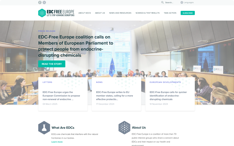
EDC-Free Europe is a coalition of public interest groups representing more than 70 environmental, health, women’s and consumer groups across Europe who share a concern about hormone disrupting chemicals (EDCs) and their impact on our health and wildlife.
The organisation got in touch with us, because they were looking for a redesign of their website, complete with rebranding. While the EDC-Free Europe made great strides in creating reports, campaigning lawmakers and creating an international coalition, their message didn’t show as well as they wanted through their website. This is where we started.
Research tools
To learn more about the EDC-Free Europe and their needs, we used a set of tools tailored for this project. On some of these we worked together on the project kickoff meeting, other we have completed during later stages in the project.
Proto-personas
Proto-personas are a simplified version of personas that promote empathetic and user-oriented thinking, but with significantly less investment in time. A cross-functional team can easily create them without any customer research.

Content inventory
A content inventory is basically a spreadsheet cataloging all the content of a website. Aside from the actual content, a good content inventory includes URLs, page titles, section titles, desired action (keep, modify or delete) and the replacement text.
Card sorting
Card sorting is a method used to create the information architecture of a website. In a card sorting exercise, participants organise topics into categories that make sense to them and they also label these groups. These groups will become the navigation of the website.
Moodboards
Moodboards are collages where relevant images and other visual content is assembled to represent the feeling the website should convey.
The challenge
The old EDC-Free Europe website was built in WordPress. At Evermore we are not fans of this platform, as it quickly becomes painful to scale and always has security issues. Thus migrating the content and rethinking the existing design was demanding. As the website used many different content types and topics, we needed to find a place for them in the navigation.
Another challenge was to rebrand the organisation and frankly this one was completely unexpected. There is no universal symbol for EDCs, so we were not sure which direction should we go? After several rounds, we have ended up with the final logo that all stakeholders are happy with.
After having the new logo in place, things sped up: our sitemaps turned to wireframes, wireframes into designs and finally designs into code.
The solution
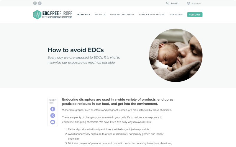
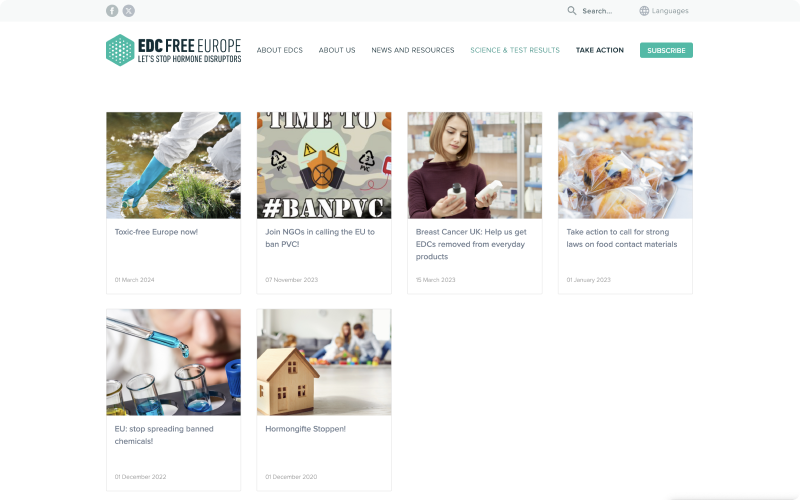
The new EDC-Free Europe website got a clean and tidy design and we believe it is very simple to navigate between different topics. Additional resources, such as reports and booklets are now visible and available on every content page. We built the new content management system on Ruby on Rails, where editors can update and categorise content. We also implemented a functionality to create custom landing pages that can be used for social media campaigns.
Technology stack
Team setup
- 3 Developers
- UI Designer
- Product Manager
The outcome
We are glad that we had the chance to participate in this project and transform the digital face of the organisation. The promotion of a toxic-less future is something, which we all stay behind and hope that EDC-Free cause will spread quicker now with their platform.
This project sets the beginning of a great professional relationship and we are looking forward to our future collaboration.
Up Next